Your Cart is Empty
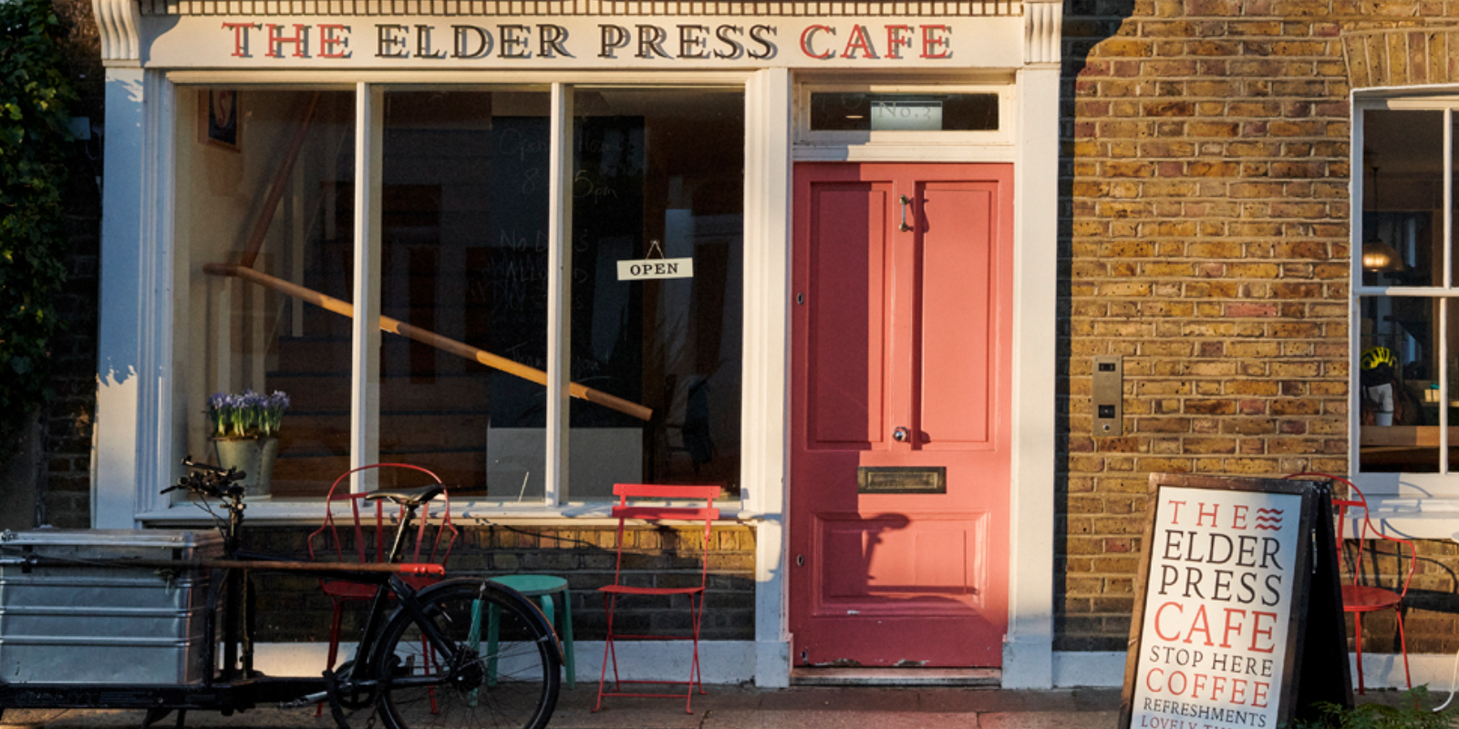

A tale from besides the Thames - our work for The Elder Press Cafe
In the April of 2019 we received a short email entitled ‘Branding’ and enquiring if we would like to work on a new cafe project. Well, yes!
We met Lindsay Elder as soon as we’d returned from our annual trip to Dartmoor and were excited and inspired by her plans for a new cafe rooted in the local community. Our brief was to develop the brand strategy, name and visual identity.
We knew the building she had acquired on South Black Lion Lane from its previous life as a design company and its location right on the Thames is an area we know well for both its delightfulness and rich cultural connections. We already knew the story of Doves Type and its sad watery end, the links to William Morris, Eric Gill and Edward Johnston and the location of Eric and Tirzah Ravilious’s flat just downstream on the corner of Weltje Road. Lindsay could not have come to a more willing pair of creatives.
Suffice to say, we were bubbling with ideas, and looking back at our first presentation to Lindsay, probably overwhelmed her with our enthusiasm and cornucopia of visual ideas. We had some naming routes in our very first presentation and Lindsay (such a great client) was clear about the direction she wanted to take. We soon worked up some concepts to extend the route across applications from fascia to menus, ‘A’ boards to loyalty cards. We worked with the natural choice for typeface, Doves Type, a digital recreation of Thomas Cobden-Sanderson and Emery Walker’s original.


The interior design of the cafe by Kate Guinness is exquisite. I think this set a standard for the quality and taste demanded from our scheme and also reflected the commitment and discernment of our client, Lindsay. We are especially proud that the name, The Elder Press, captures the history of the area, an implicit connection to coffee and puts Lindsay’s name front and centre of the operation.

In the spirit of tradition, we commissioned Phil Abel, at the Hand & Eye Press, to letterpress print business cards, loyalty cards and postcards, ensuring the printed ephemera had a unique tactile feel and smell. Lindsay cared about every detail of the design and believed in the authenticity of every element.

The Elder Press Cafe opened in September 2019, immediately a welcome addition to the riverside landscape. 2020, of course brought the Covid pandemic, a challenging time for us all, and a tribute to Lindsay and her team that they survived - perhaps dented but not daunted.

We’ve have kept close to Lindsay since the launch, not least because it’s our favourite local cafe, but also to guide the brand’s development and support Lindsay wherever we can. In late 2021 Lindsay asked us to re-look at the website and perhaps develop a map of the area - something we had talked about from the beginning of the project.

The website refresh was really about putting the tasty treats and beautiful environment of the cafe centre stage and cement its place as rooted in the local cultural heritage. Photographs were commissioned from Catherine Gratwicke of interiors, food and the surrounding cultural highlights, creating the core visual assets of the site, along with the visual identity. Alongside the website, we have instigated a monthly newsletter to generate visits to the cafe, including a quiz on the local artistic history with the chance to win a morning bun.

The Elder Press Map is a distillation of the rich background that has inspired our work. Researched, written, designed and illustrated by us, it’s a delightful artefact to enhance The Elder Press experience and encourage people to explore the area and return to the cafe for a tasty treat. Launched at the cafe in March 2022, it feels like a step forward in the development of The Elder Press, and hopefully the start of an annual series of printed delights. Of course, most of what’s happening at this time concerns the war in Ukraine. We took a moment at the launch to think of the people in Ukraine and the cultural heritage that is being destroyed right now, and perhaps that’s why it’s important to celebrate and cherish what we have here. The map was printed by Calverts, excellent printers and workers’ cooperative, in East London.


Our latest project for the cafe is the Doggyfesto. Whilst The Elder Press Cafe welcomes dogs, it’s important that a certain etiquette is in place for their behaviour. Respecting that not everyone likes dogs, and that a cafe has to have very strict health and safety procedures was core to the design whilst engaging the dog loving customers in a productive dialogue to encourage a harmonious environment. Whether it works will take a while, but initial results are looking positive.


